
- REACH
- abu dhabi
- 110m2
- f&b
- complete
stylistic
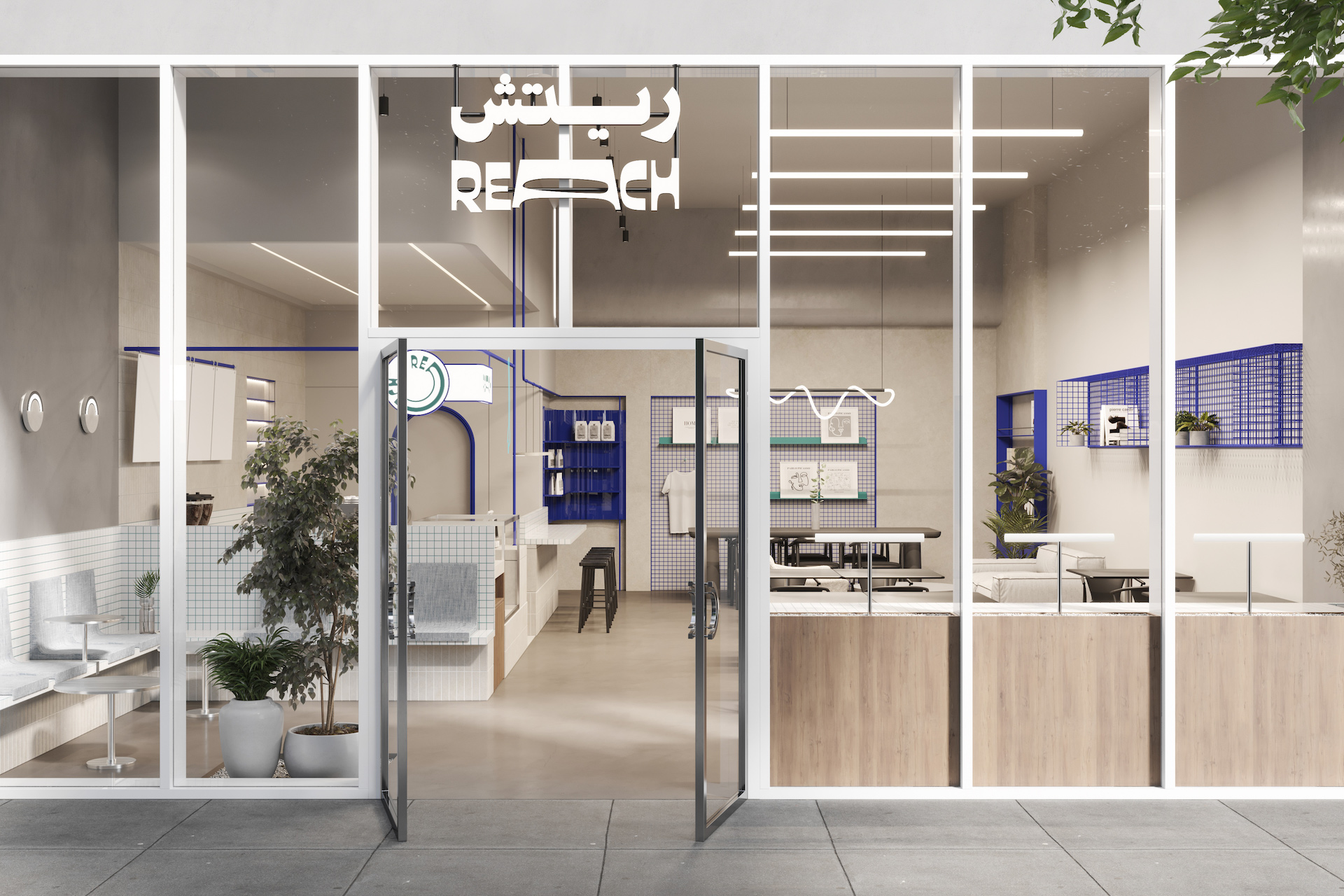
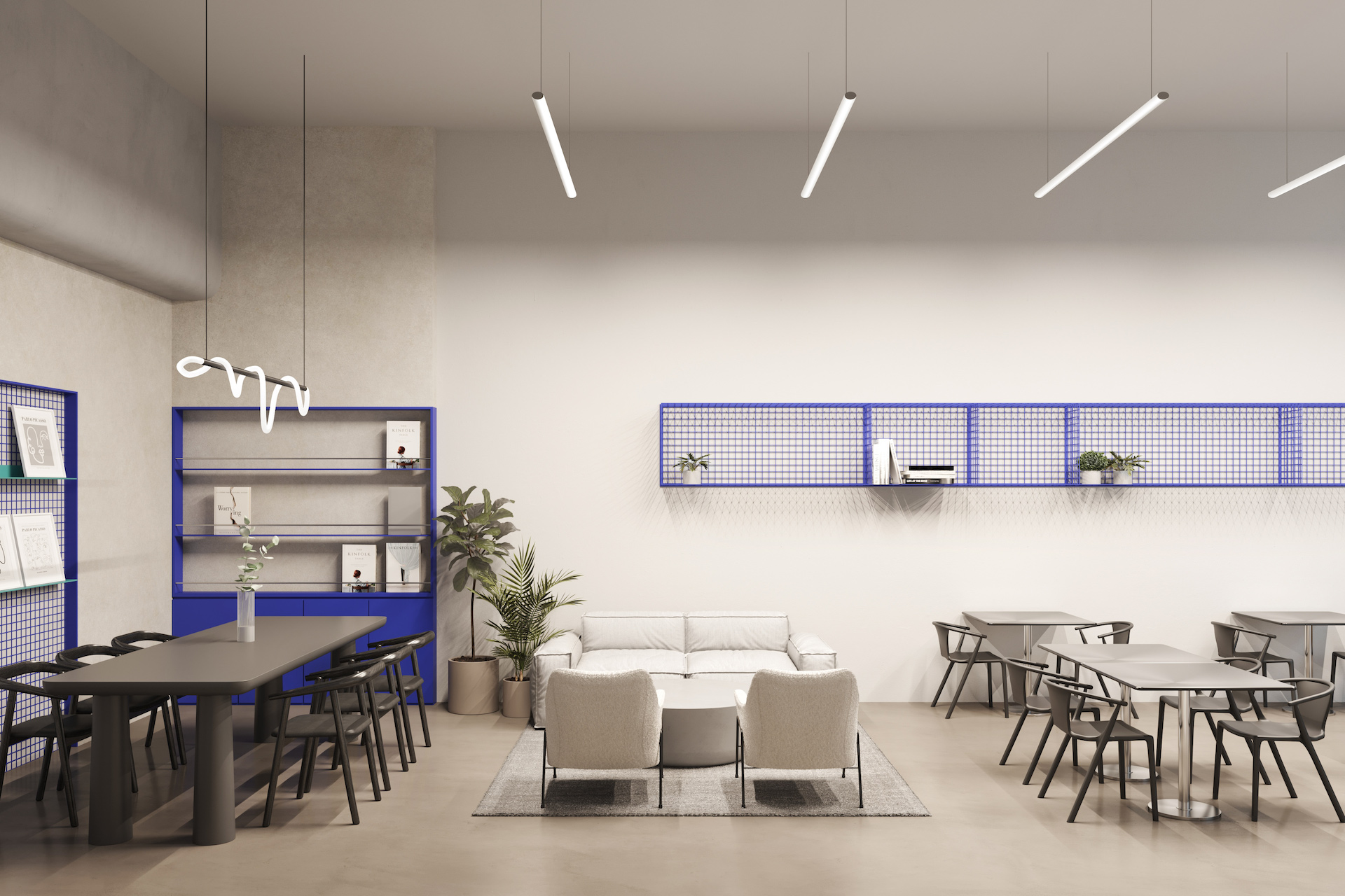
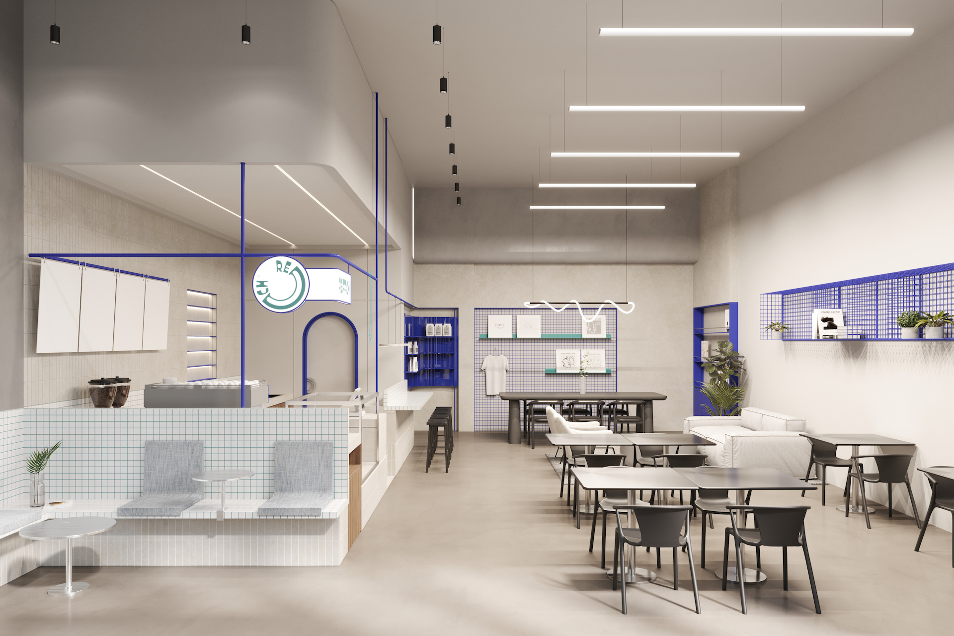
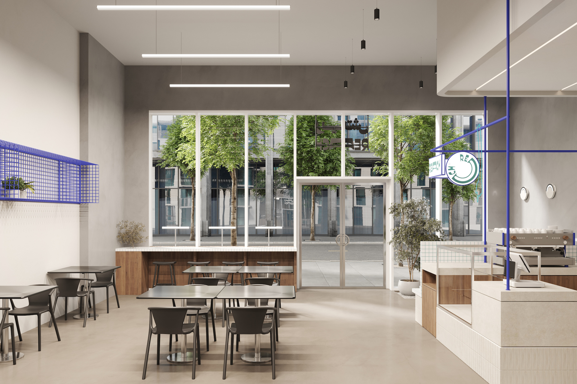
As newcomers into the UAE’s growing fast food scene, the brief for REACH was to create a friendly, neighborhood eatery that was both memorable and note-worthy.
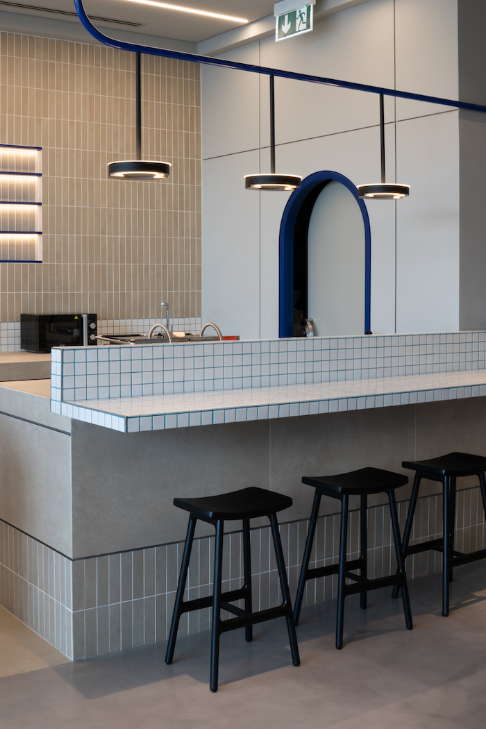
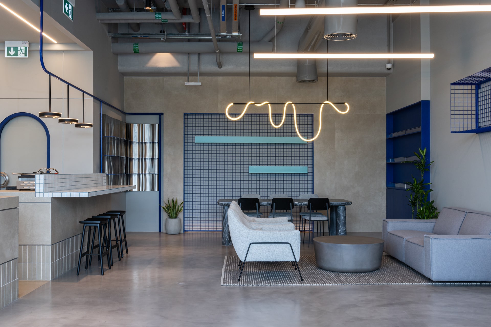
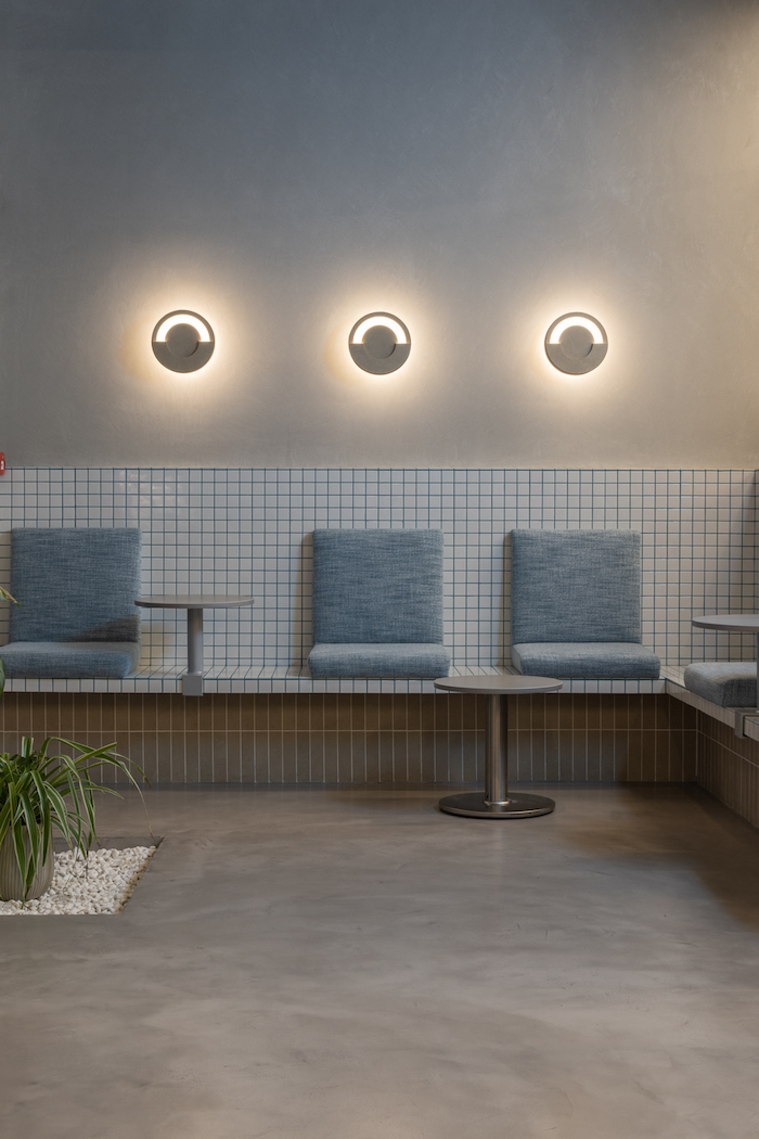
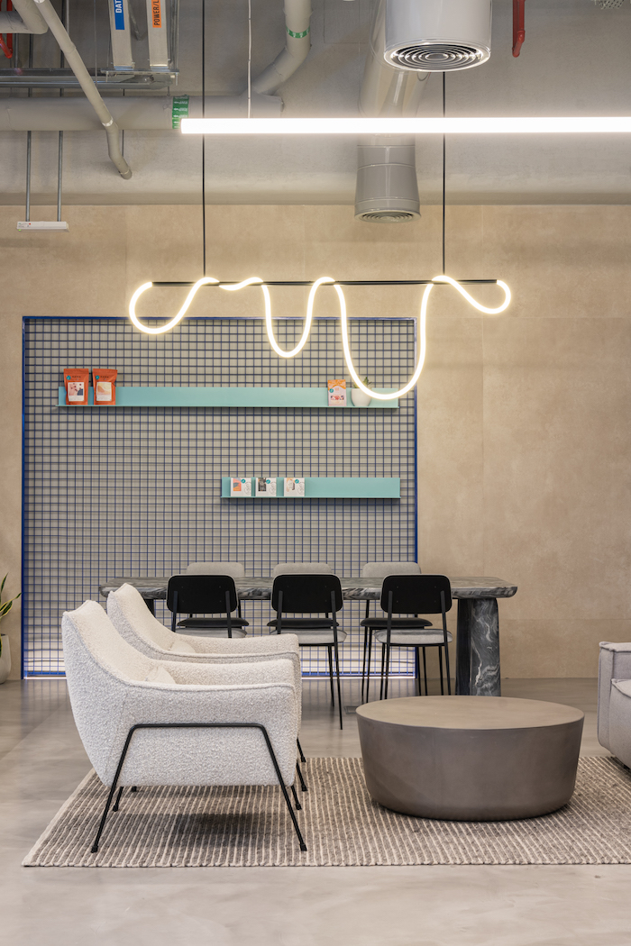
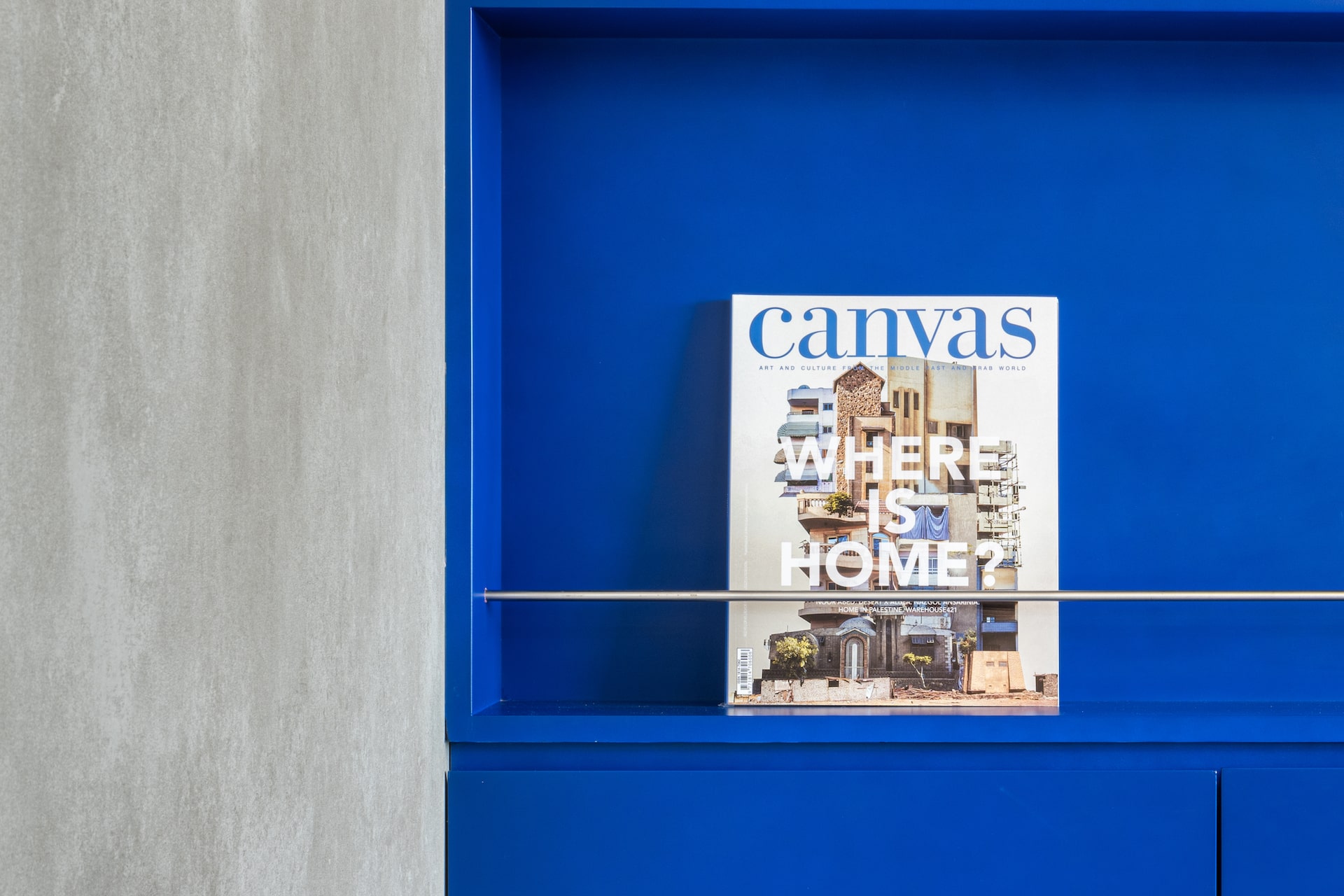
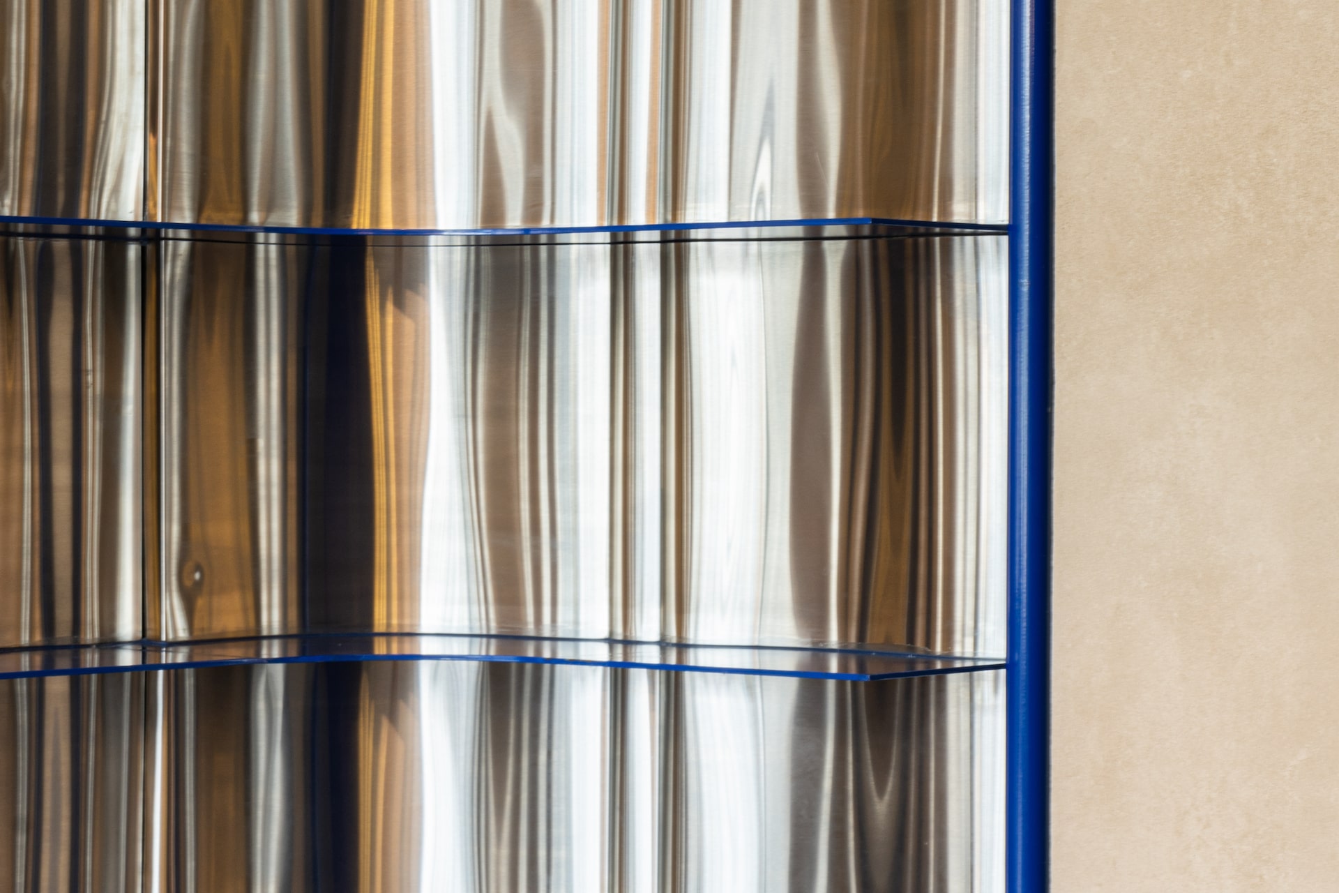
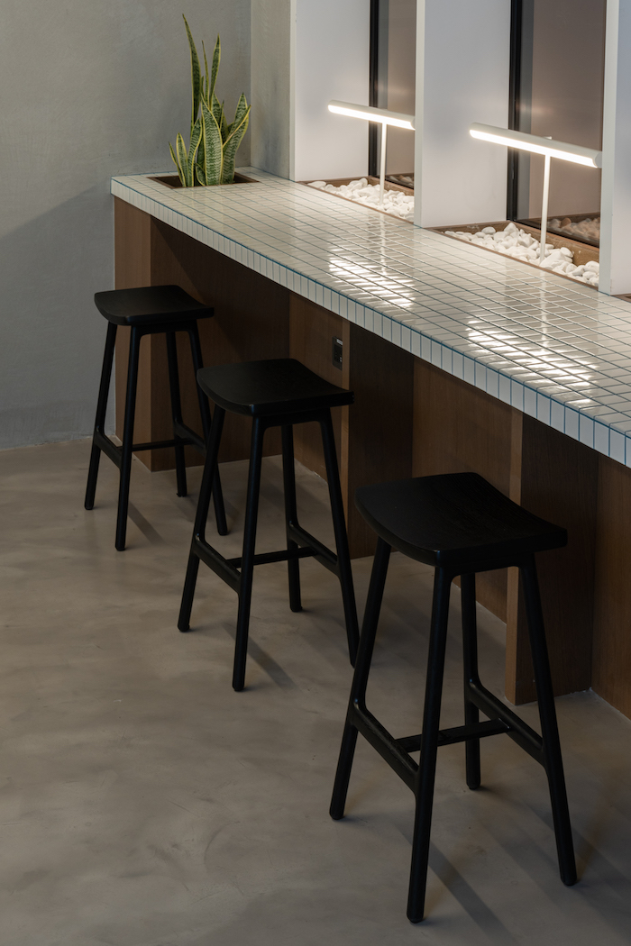
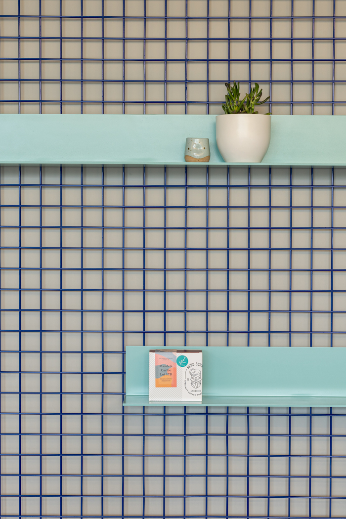
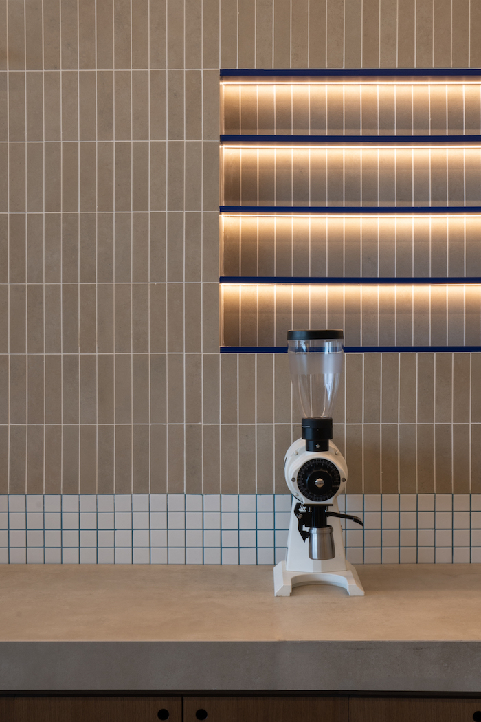
With quirky design elements, a colorful and eye-catching interplay of tiles, hidden elements of surprise and bold injections of color were incorporated throughout the space, eventually forming the brand’s trademark identity.
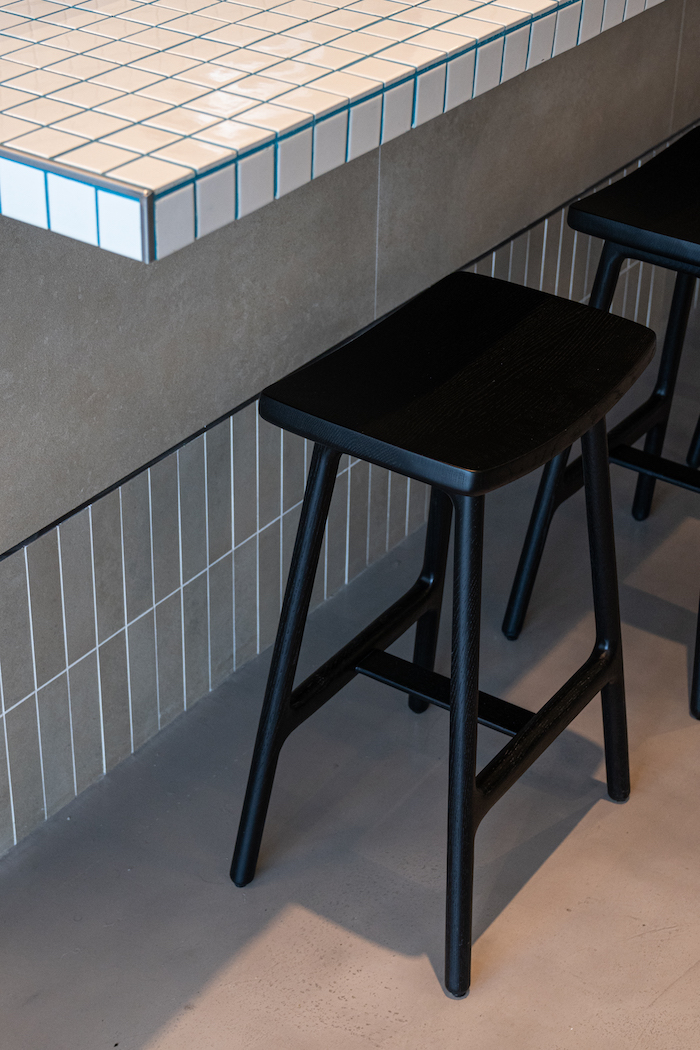
In referencing context and location, interpretations of Middle Eastern design elements will subtly feature, the focus being on the play of geometries – with strong parallels drawn with aligning lines, squares and rectangles with circles and more organic forms. These are contrasted with woods and neutral tones featured throughout – with browns and beiges bringing a warmth to the overall space.
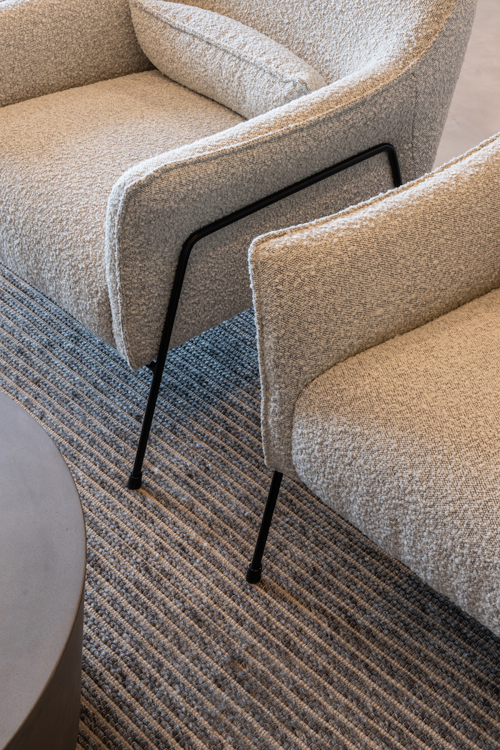
Visuals into the kitchen are kept fully open, and play a prominent role in reflection of the brand’s wholesome experience and openness between staff and customers. The space advocates an inclusive setting, with various seating types catering to everyone from solo regulars to larger groups – whether business to leisure. The overall design intent is for the interior to evoke an experience that speaks for the brand – one that is authentic and memorable.